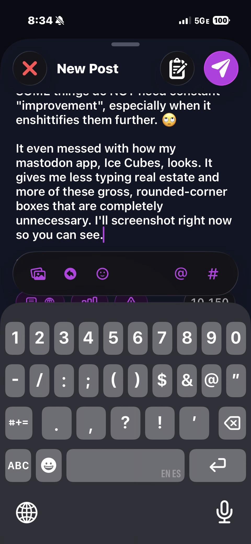
#ios26 is UGLY UGLY UGLY to me. I don't like it at all!
I did all of the accessibility changes I could to make it less gross-looking, but I still hate it (as I, a professional curmudgeon, knew and stated I would). The fuck are all these transparent boxes around things? They are ugly and distracting.
I am so very tired of middle managers that are just scrambling to keep their jobs essentially fucking the entire world up all of the time in the name of Oooh, Shiny. This shiny is a veneered turd.
SOME things do NOT need constant "improvement", especially when it enshittifies them further. 🙄
It even messed with how my mastodon app, Ice Cubes, looks. It gives me less typing real estate and more of these gross, rounded-corner boxes that are completely unnecessary. I'll screenshot right now so you can see.
Slow your fucking roll, #Apple. Your UI designers SUCK.
