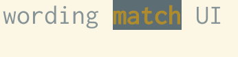
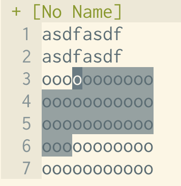
does anyone have tips for setting up a colourscheme in the shell that doesn't have some horrible clash in it somewhere? I'm trying to write down advice but personally my approach has been "just use Solarized Light & accept that some things will look bad occasionally” and that doesn't seem great (some "bad" things in the screenshots)
curious to hear anything that's worked for you! The only thing I know of that seems useful is the "minimum contrast" feature some terminal emulators have