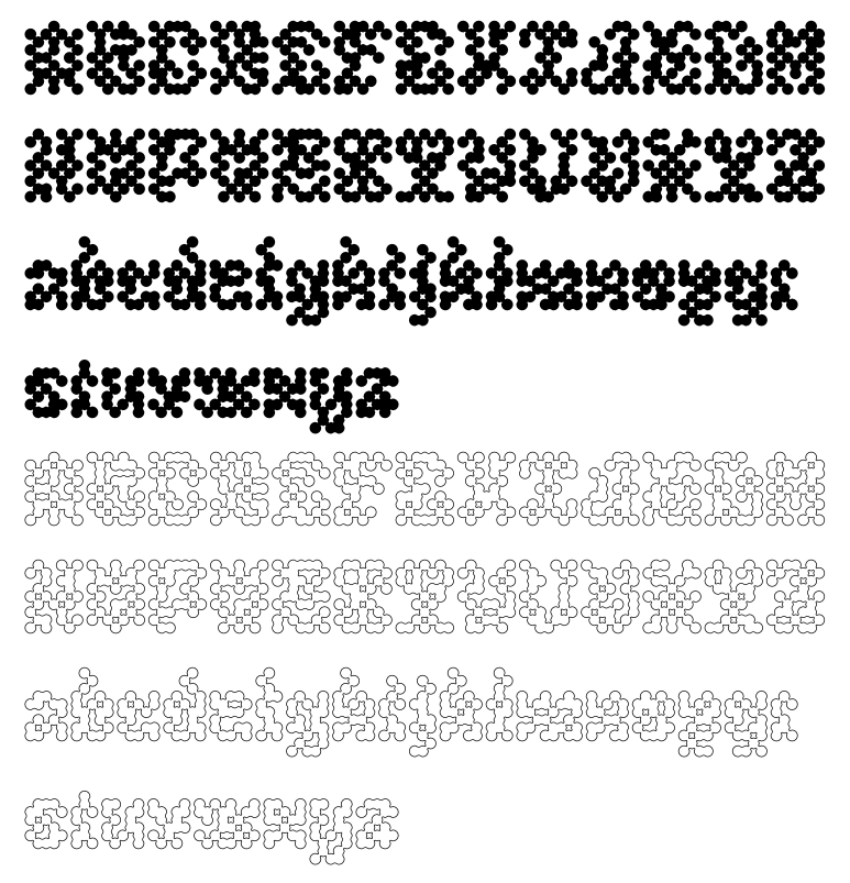
Dear type community, please, I'm curious, how would you approach spacing in a typeface as inconsistent as Plasmid? I was toying with the idea of Letterspacer but I would like to do this properly. Unfortunately I have pretty much zero glyph I can use as a basis haha, except a few linked metrics like m and n. Should I still try to start from H and O? For now I have pretty much everything set to 20 each side but I sense it's not the right way! Thanks so much :)