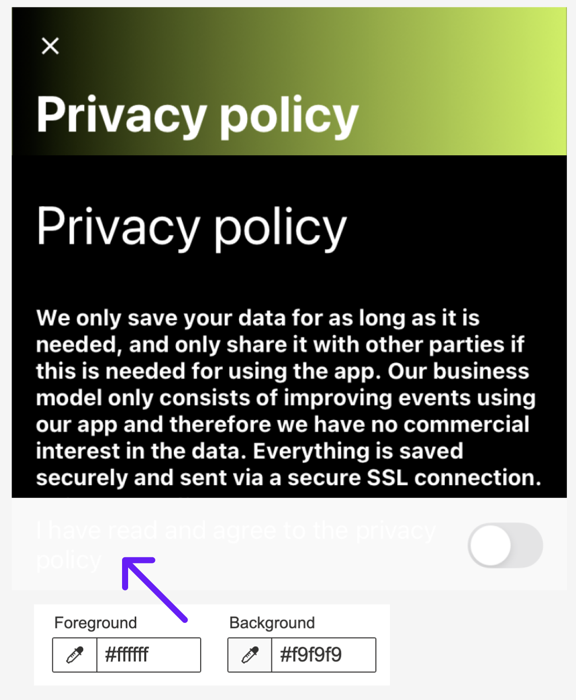
They're rarely found out in the wild, but today is our (un)lucky day! Hold your pearls as I present a rare but very real occurrence: a #color #contrast ratio of 1.1 to 1 👀
Sufficient colour contrast is so important for content to be easily perceived. Aim for a minimum contrast ratio of 4.5:1 for regular text and 3:1 for large or bold text.
Protect your eyes and the eyes of others. Don't make them work harder than necessary. Reading a privacy policy statement is hard enough already.