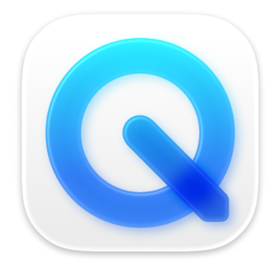
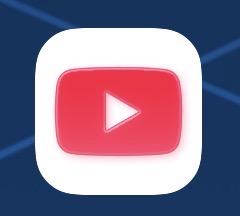
I know I have aging eyes but the more I look at Liquid Glass app icons the fuzzier they get. The subtle glass bezels, reflected edge highlights and soft chromatic shadows result in an icon that is super soft and fuzzy at size.

I suppose I’ll get used to them but they are negating these high res retina displays big time. It’s like I’m looking at the icons through cheese cloth or something.

Liquid glass version of the QuickTime icon. Created from blue pieces of translucent glass with soft subtle edge treatments and soft blue chromatic shadowsLiquid glass treatment of the YouTube icon, red rounded wrecked shape with soft edges and subtle red drop shadows
0
0
0

If you have a fediverse account, you can quote this note from your own instance. Search https://mastodon.social/users/gedeonm/statuses/114661723513742345 on your instance and quote it. (Note that quoting is not supported in Mastodon.)