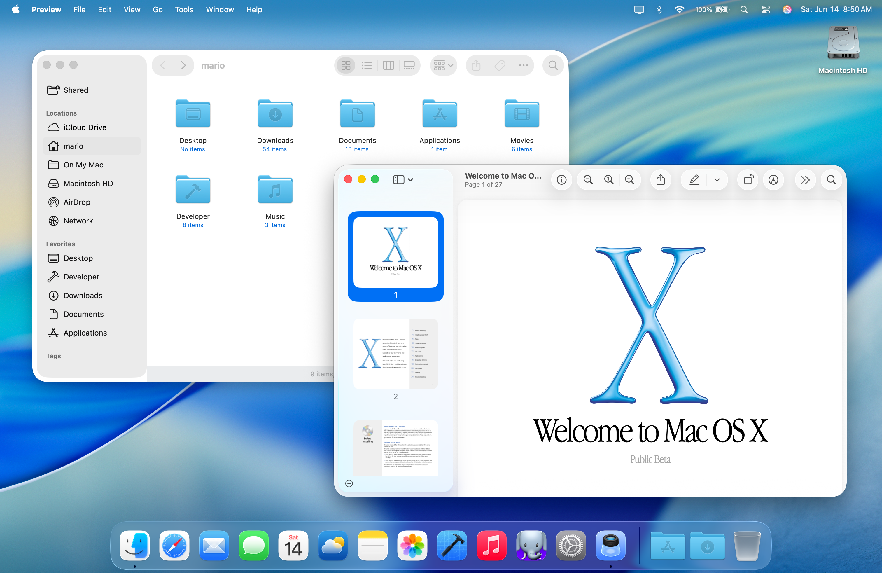
In Big Sur, one thing that bugged me about the new full-height sidebars & inspector sidebars is that they took so much real-estate from toolbars.
Now with chonkier controls everywhere and in toolbars with #macOSTahoe, everything just feels more cluttered on my 14" MacBook Pro.
As you make windows smaller, toolbar controls prematurely get thrown into an overflow menu. I have to remove buttons just to make it more usable these days.
Very dense UI on the Desktop is not a bad thing.