There was a golden period of OS X roughly between 10.5 and 10.9.
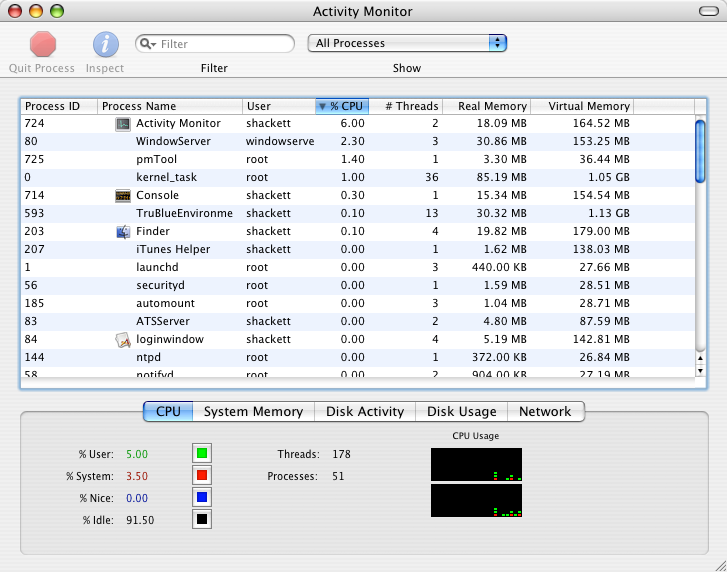
Up to 10.4, windows were too textured: stripes, brushed metal.
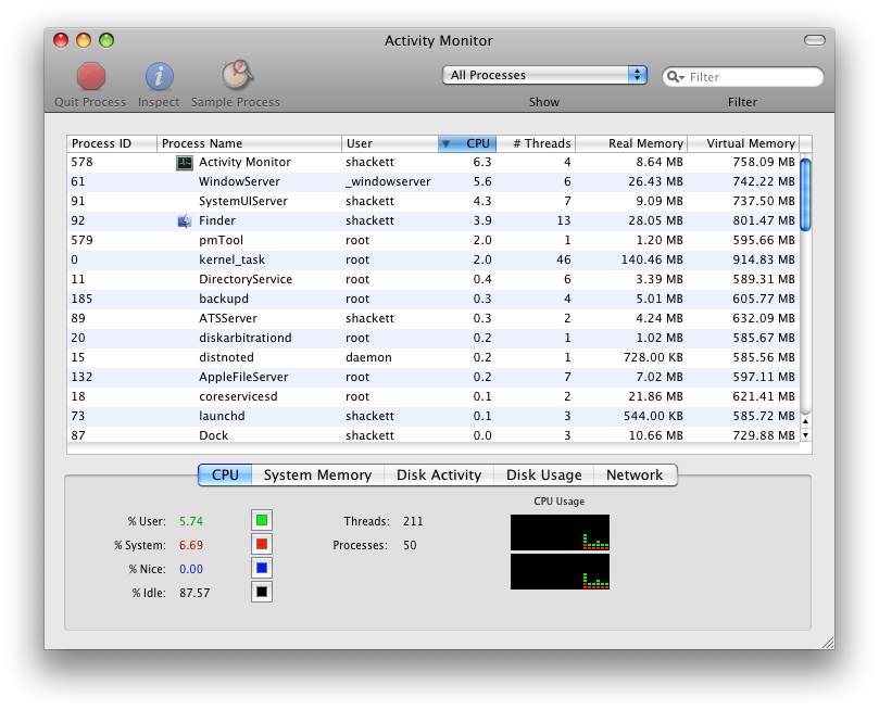
In 10.5 till 10.9 we got to enjoy the beauty of Aqua paired with calm, tasteful gray window frames and controls that had visible depth.
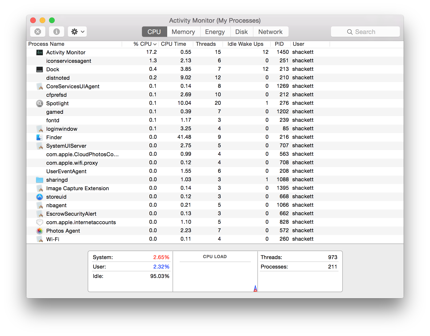
From 10.10 till 10.15 was okay-ish: the flat took over, but we still had contrast and shapes.
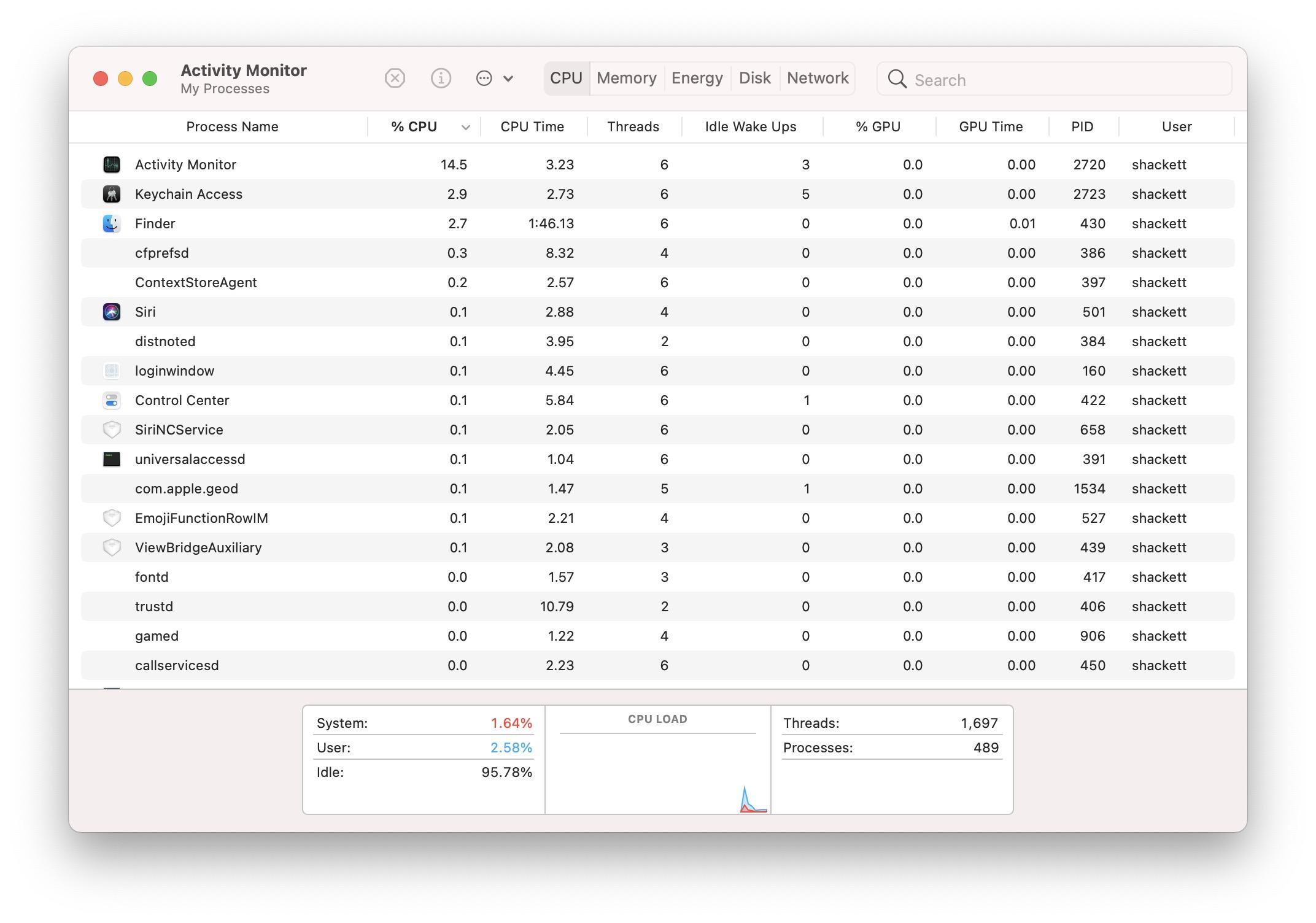
Starting from 11, everything became rounded, low contrast and lost visual cohesiveness.
10.5 till 10.9. We didn’t know how good we had it


