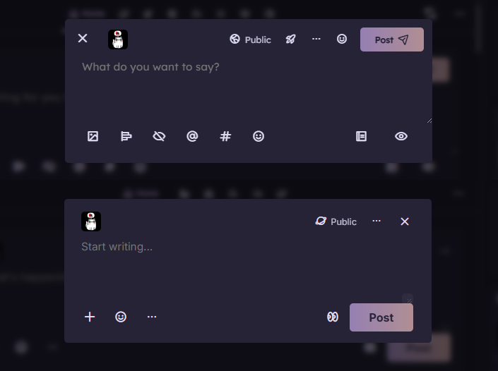
Now that the beta is out, I can start showing some of the changes I'm making! Let's start with the redesigned posting form, where I finally got to implement a design that I had first drafted back in Firefish (or was it Calckey?). At the top is the current Sharkey posting form, at the bottom the redesigned, more minimalistic Catodon posting form. This will also give you a general idea of my approach to UX design, and the direction of the new platform.
1. The "Post" button (with a larger font, and without the icon) is at the bottom right corner, closer to where your post would usually end.
2. The posting form expands as you write, a feature I ported from Firefish - which makes moving the Post button more useful, since it was in a kinda awkward position when writing longer posts.
3. The "X" closing button is at the top right corner, where most people would expect it to be.
4. Only the most frequently used icons are visible by default, decluttering the posting form for a cleaner look. The lower "..." menu opens on hover, meaning no extra click from desktops and laptops.
5. When you click "Show preview", the bottom row buttons stay between the typing area and the preview, instead of going all the way to the bottom. This makes it easier to access the buttons while having the preview open, and also keeps the "Show preview" button at the same point, so that you can expand/collapse the preview without having the button jump lower, as in Firefish and Sharkey.
#Catodon #Sharkey #Firefish #Misskey