There's this movie called Devil wears Prada that is getting a sequel this year. I kind of liked the original one, it's a movie that doesn't require you to think much, the cast is good, so...
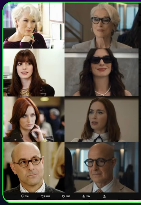
But now, some youtube channel actually tries to compare the color grading of the new one and calls the DWP2 "Lifeless".. which, if you see the included screenshot, is obvious why.
And they were actually asking why is this happening, why almost every new movie has this "Netflix color profile" - and I think there's the answer - the home box and streaming is such a huge percentage of the revenue they don't have to care about visuals - everyone will stream / view it on the LCD / OLED screen with maximum saturation for the image to be "likeable".
Back to the B&W movies, please 🙂 (writing this while downloading Otto e mezzo )