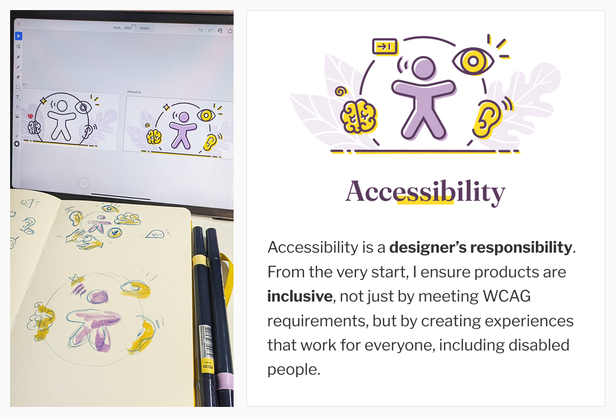
I've created a nice new illustration for my accessibility section!
It was not easy to find a way to represent accessibility, while matching the style of the other illustrations.
The text is a work in progress, I'm never happy with those. So, it will evolve in the future.

Check it in context with my other domains of expertise: stephaniewalter.design/

Also thank you to @juliemoynat for the idea of adding a little tab key to represent people with motor disabilities.

Collage showing the design process for an accessibility illustration. On the left, a notebook with sketches and a tablet with draft illustrations. On the right, a finished design of a purple figure looking like the Vitruvian man speaking, surrounded by icons of an eye, ear, a brain, and a tab key. 
Text reads: Accessibility. Accessibility is a designer’s responsibility. From the very start, I ensure products are inclusive, not just by meeting WCAG requirements, but by creating experiences that work for everyone, including disabled people.
0

If you have a fediverse account, you can quote this note from your own instance. Search https://front-end.social/users/stephaniewalter/statuses/115072188067380390 on your instance and quote it. (Note that quoting is not supported in Mastodon.)