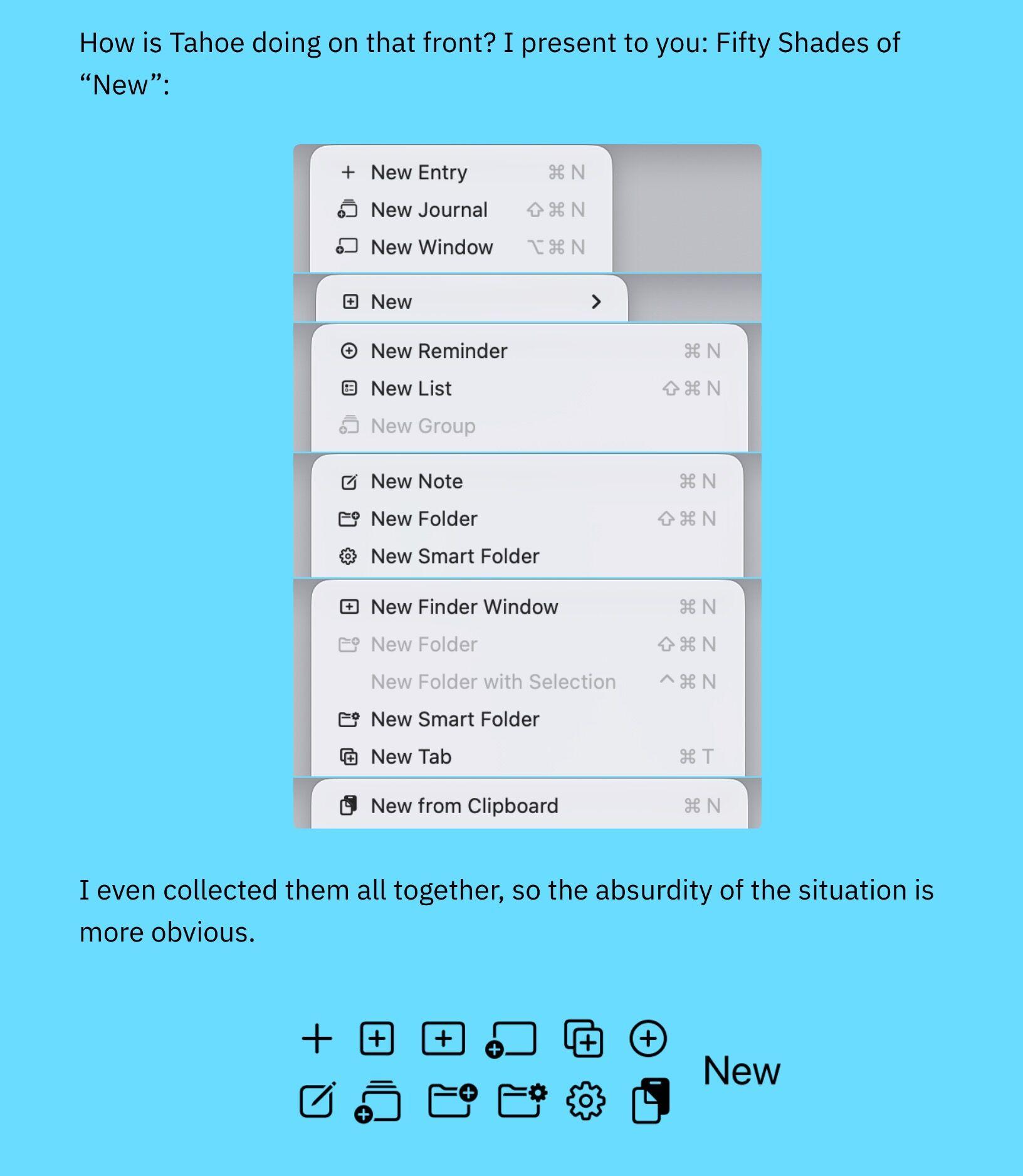
It’s hard to justify Tahoe icons! ![]() @nikitonsky points out all the inconsistencies, in the icons of Tahoe, the new Mac operating system. The “fifty shades of new” made my day. If you can’t find a good metaphor, using no icon is better than using a bad, confusing, or nonsensical icon. They are also very small, hard to differentiate and confusing. When everything has an icon, nothing stands out.
@nikitonsky points out all the inconsistencies, in the icons of Tahoe, the new Mac operating system. The “fifty shades of new” made my day. If you can’t find a good metaphor, using no icon is better than using a bad, confusing, or nonsensical icon. They are also very small, hard to differentiate and confusing. When everything has an icon, nothing stands out.