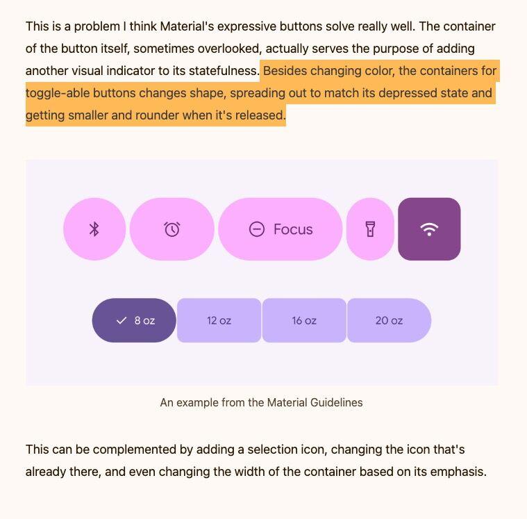
It’s always complex to visually convey the state of toggle buttons to the users. Liam Spradlin argues that Material design’s “expressive buttons” solution that changes the shape of the container, on top of icons and sometimes name change works well. I’m curious if users agree.

Also, this works well for mobile, when buttons are gigantic and cutely rounded. Would this work for complex UIs where you need to put a lot in a screen (bank tools, CRMs, etc) ?

interfacecafe.com/the-state-of

Screenshot of the article showing Material Design buttons demonstrating container shape changes on press. When the button is active, the border radius is reduced, the color changes, and for some buttons, a little checkbox appears next to the selected one. 
Highlighted text reads: Besides changing color, the containers for toggle-able buttons changes shape, spreading out to match its depressed state and getting smaller and rounder when it's released.
0

If you have a fediverse account, you can quote this note from your own instance. Search https://front-end.social/users/stephaniewalter/statuses/116209527599788956 on your instance and quote it. (Note that quoting is not supported in Mastodon.)