It's 100% intentional that mobile providers don't give you an easy way to see your overall data usage, right?

Like, Telstra gives you a bar chart of up to the last 3 months (not 90 days - if you were halfway through a month, you'd get 2.5 calendar months of data), but nothing more granular.

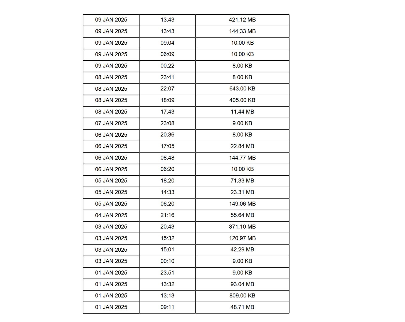
Woolies lets me view seven days of usage, or download a PDF of up to 90 days, all with mixed units and poor enough formatting I can't easily get it into a spreadsheet.

This is anticompetitive bullshit.

A screenshot of a table of data. It shows data usage of a mobile phone, from the first to the ninth of January 2025. There are multiple rows of data per day, because each individual session is counted - the 9th of January for example shows 421.12MB, 144.33MB, 10KB, 10KB and 8KB. There is no sum of data used per month or even per day.
0

If you have a fediverse account, you can quote this note from your own instance. Search https://digipres.club/users/timixretroplays/statuses/115268494418548222 on your instance and quote it. (Note that quoting is not supported in Mastodon.)