I have a design issue I can't quite settle on, mostly because it doesn't massively matter, but I would like to figure it out properly. So I'm going to run a couple of polls here to find out how people feel about it.
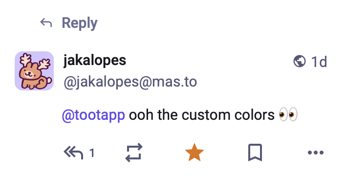
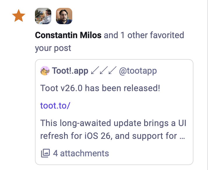
Namely, when displaying notifications, both the Mastodon web interface and Toot! have two different styles they use: Either a full post like on a normal timeline, or a sort of compact version shown embedded in the notification message.
The two are shown below:

