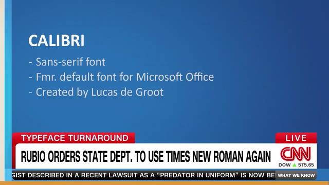
The U.S. State Dept. font story is pretty silly, but I do like that it gives the broader public a chance to learn more about a craft they encounter every day. Here’s the designer of Calibri, Luc(as) de Groot, on CNN talking parameters, spindly serifs, and the origin of Times! https://video.snapstream.net/Play/2UPcOhfTcPtRvtb84Mfqmn?accessToken=dlk0bu2dwzjxj
(Thanks to Volker Rosenfelder, my FontShop colleague, for sending this along.)
Meanwhile, CNN continues to embarrass itself with squashed all-caps Helvetica, as if it’s 1995.