🕐 2026-03-21 00:00 UTC
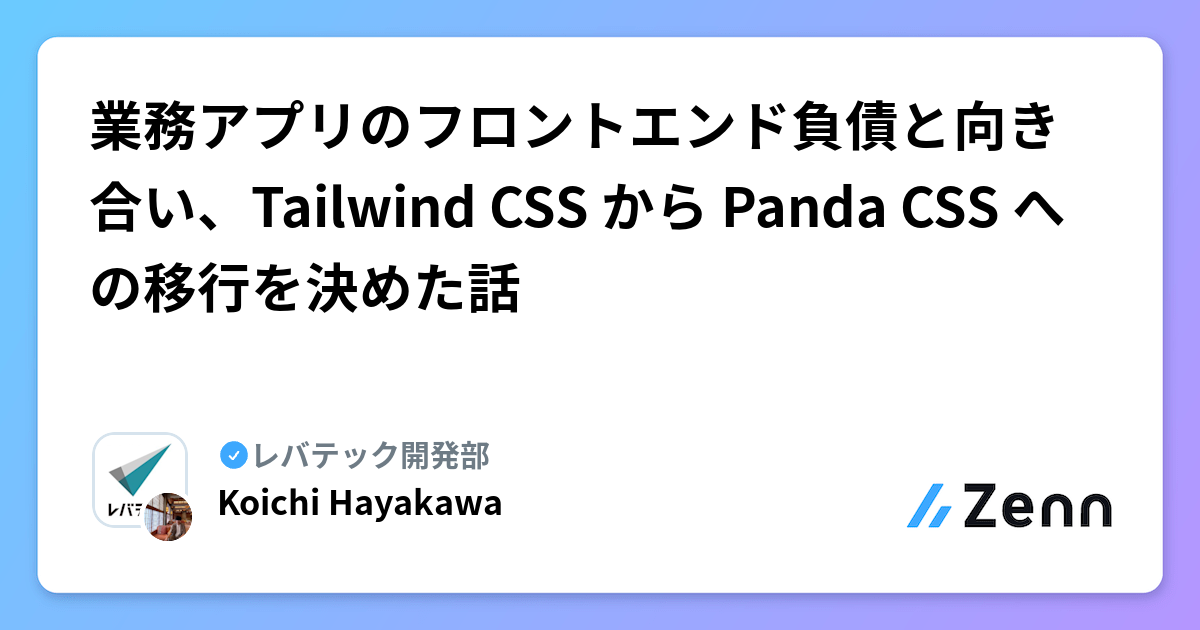
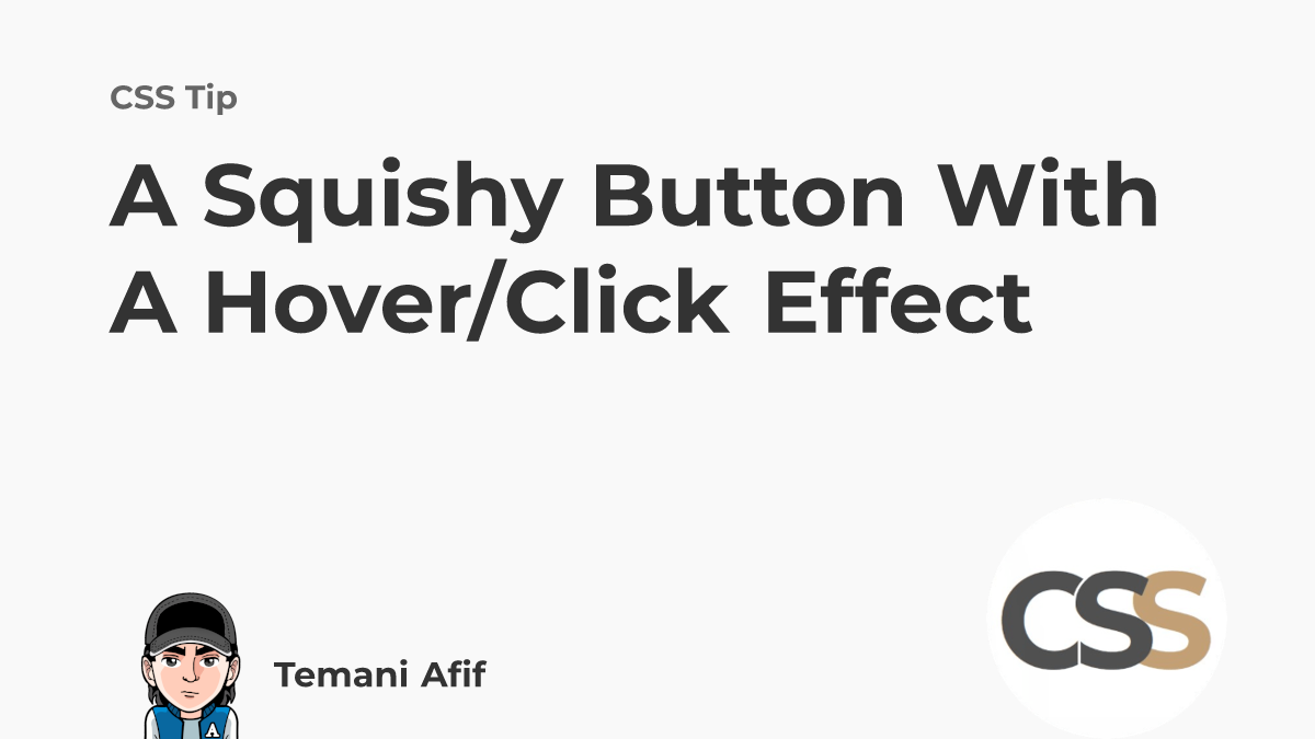
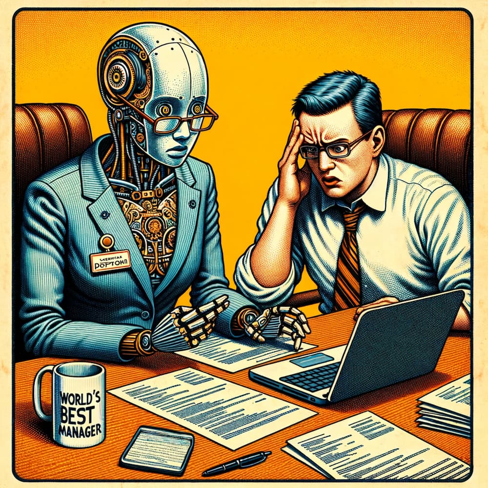
📰 生成AI時代のドキュメント基盤 (👍 71)
🇬🇧 Explores spec-driven development & documentation strategies for the generative AI era, covering tools like AWS Kiro & GitHub Spec Kit
🇰🇷 생성 AI 시대의 사양 기반 개발과 문서화 전략을 탐구. AWS Kiro, GitHub Spec Kit 등 도구 소개
🔗 https://zenn.dev/nuits_jp/articles/2026-03-19-genai-documentation-foundation


 @
@
 @
@![This is a pop-up window titled "Follow This Blog" with the subtext "Get new posts delivered straight to your Mastodon timeline — no algorithms, no ads, no email inbox clutter. Just chronological blog posts from a fellow human." It has two main sections: the first section states "1 Already on Mastodon? Enter your server below:" with a text input field displaying "[@] mastodon.social" and a green "Follow" button below it. The second section states "2 New to Mastodon? It's a social network where you are in control." followed by three bullet points: "No ads, no algorithms deciding what you see" with a red circle icon, "Your feed is just posts from people you follow, in order" with a purple square icon, and "No company owns your account — you can move it anytime" with an orange lock icon, along with a green button labeled "Create a free account →". Below these sections, under the heading "OTHER OPTIONS", are buttons labeled "RSS Feed" and "Substack", each accompanied by a small icon. The window also has an "X" button in the top right corner to close it.](https://media.hachyderm.io/media_attachments/files/116/206/471/606/849/265/original/c36b1b3f6f382e4f.png)


 @
@


 @
@


 @
@
 @
@

 @
@

 @
@
 @
@